

Digital Bus Shelter Brand Strategies for Modern Outdoor Advertising
2026-09-04
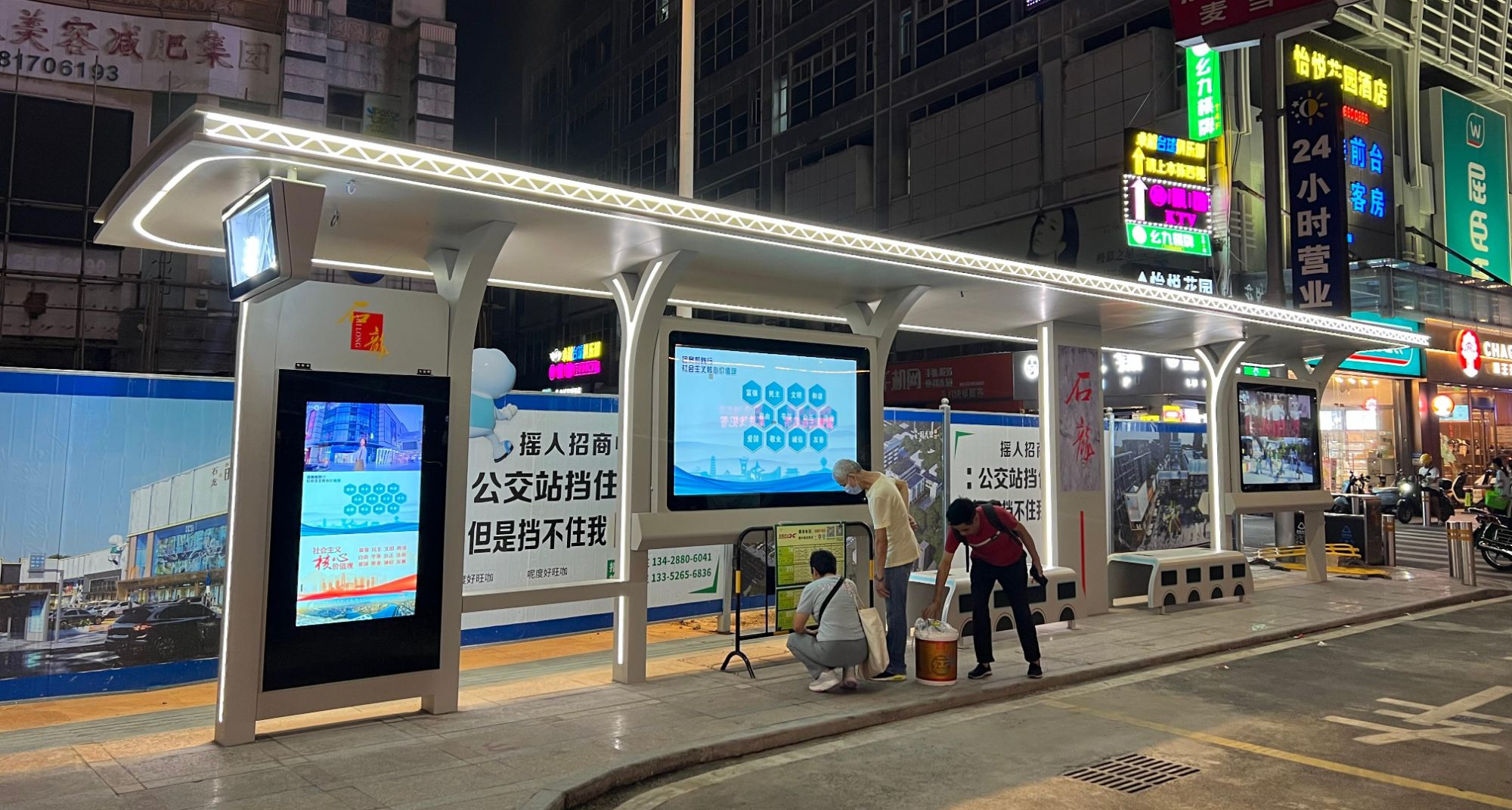
Imagine a bus shelter that doesn't just display ads—it adapts to commuter flow, weather, and even time of day, turning a static wait into a dynamic brand moment. While most outdoor advertising still relies on printed posters that fade and get ignored, digital bus shelters are quietly rewriting the rules of engagement. Yet many brands overlook this high-footfall, high-dwell-time medium simply because they don't know how to harness its real potential. zemso has been at the forefront of this shift, helping advertisers move beyond basic loops and into contextual, measurable campaigns that actually resonate with modern urban audiences. Here's how to build a winning digital bus shelter strategy that doesn't just capture eyes, but changes behavior.
Why Static Posters Are Losing the Battle for Commuter Attention
A commuter’s gaze now belongs to a six-inch screen, not a forty-inch poster. The moment a train pulls in or a bus lurches forward, hundreds of heads dip toward feeds, messages, and streaming clips. Static posters, no matter how bold the typography or clever the tagline, are simply outside that focal path. They ask for a deliberate glance in an environment where attention is already rationed down to the second. Unlike a push notification, a poster cannot tap a shoulder or vibrate in a pocket. It just hangs there, fading into the same visual texture as safety notices and route maps.
The real problem runs deeper than distraction. Static posters are frozen in time. They cannot reflect a delayed train, a sudden downpour, or a platform change. They cannot offer a discount that expires in the next ten minutes or show the nearest coffee shop when a commuter is already late. Digital screens and phones win because they answer the unspoken question of the moment: what do I need to know right now? A paper poster from last week has no answer. Over time, commuters learn to treat these fixed images as background noise, not information.
There is also a fatigue factor. The same poster seen forty times in a week becomes invisible. Commuters build mental filters that erase anything static, predictable, and unchanging. Without motion, relevance, or the promise of something fresh, a poster cannot compete with the endless scroll of a smartphone. Advertisers who keep pouring budgets into these one-way, one-time messages are effectively paying to be ignored. The battle for commuter attention is not about being seen once; it is about earning a second glance, and static posters rarely get the chance.
Turning Wait Time into a Branded Interactive Moment
Waiting doesn't have to feel like a dead zone. Instead of letting users stare at a loading bar or a blank screen, brands can fill that pause with something that actually holds attention. A quick trivia question, a playful animation tied to the product, or a mini tip that solves a real problem—these small touches turn an idle moment into a chance to reinforce what makes the brand distinct.
The key is to make the interaction feel native to the experience rather than a forced distraction. For example, a food delivery app could show a short, whimsical story about the restaurant preparing the order, complete with sound effects that match the pace. A financial service might offer a 10-second budgeting challenge while a report loads. These aren't just fillers; they give users something memorable to associate with the waiting period itself.
When done well, the result is a subtle shift in perception: wait time stops being a frustration and starts feeling like a deliberate, even enjoyable part of the journey. Users are more likely to forgive delays and come back, because the brand has shown it values their time enough to make every second count.
Hyperlocal Content That Mirrors the Street Corner, Not Just the City
True hyperlocal writing doesn't start with a map of the whole city. It starts with the cracked pavement outside the corner bodega, the one where the owner tapes up handwritten signs for lost cats and block parties. That corner has its own rhythm: the delivery truck that double-parks every morning at 7:40, the old men who drag plastic chairs onto the sidewalk when the shade hits just right, the kid who sells lemonade from a cooler with a broken wheel. These are the details that make a place feel lived-in, not just listed.
When you write about the street corner instead of the city as a whole, you capture what guidebooks miss. A three-block radius can hold a hundred stories: the corner laundromat that stays open until 2 a.m. because the night shift at the hospital gets off at 1:30; the mural on the side of the hardware store that gets repainted every spring by the same retired art teacher; the bus stop where someone leaves a bowl of water for dogs every morning. These micro-observations tell readers you've actually stood there, listened, and noticed the small things that don't make it onto any official tourism page.
This kind of hyperlocal content builds a different kind of trust. It tells the person two streets over that you're not just passing through—you're paying attention to the same corner they cross every day. They start to see you as a neighbor with a notebook, not a faceless publisher. And that's when they'll tell you the real stories: the barber who cuts hair for free on the first Monday of the month, the alley where the feral cats have names, the fire hydrant that got painted gold after the neighborhood saved it from being removed. Those stories can't be found in a city-wide roundup, because they only exist at the scale of a street corner.
Weather-Responsive Ads That Feel Less Like Advertising
When the forecast shifts, these ads shift with it—but they never raise their voice. A coffee chain might notice the rain starting at 3 p.m. and quietly suggest a nearby café with a warm drink, phrased more like a local weather tip than a promotion. You glance at your phone and think, “That’s useful,” not “That’s an ad.”
The trick is stripping away the usual sales signals. No urgent countdowns, no flashing buttons. Instead, a sportswear brand detects a sudden temperature drop and shows a lightweight jacket with copy that reads, “The wind this afternoon is colder than it looks.” There’s no price tag in your face, just a nudge that fits the moment.
Over time, this turns marketing into a quiet service. People stop bracing for interruption and start trusting the message because it arrives with context, not volume. The brand earns attention by being helpful at the exact moment the weather makes that help relevant—no hard sell, no noise.
Designing Shelters That Earn a Spot in Someone's Camera Roll
A shelter that ends up in someone's camera roll rarely tries to be photogenic. It earns that status by refusing to compete with its surroundings. Instead of a bold statement, the structure borrows lines from the ridgeline, mirrors the gray-blue of a passing storm, or lets a single window frame a tree that's been growing there for a century. The camera isn't drawn to the building itself—it's drawn to the way the building makes you see the place. That quiet act of framing is what turns a quick glance into a deliberate photograph.
Material choices matter more than geometry when it comes to being remembered. A wall of rammed earth that darkens after rain, a weathered steel plate that catches afternoon light at a different angle each month, a stone threshold worn smooth by boots and time—these surfaces carry visible traces of weather and use. They give a visitor something tactile to capture, a texture that changes between morning and dusk. The shelter doesn't just sit in the landscape; it records the landscape on its own skin, and that slow accumulation of marks is far more compelling than a polished, static facade.
But the surest way to earn a spot in someone's photo library is to create a moment of pause you can't find anywhere else. A bench placed exactly where the wind drops, a narrow opening that makes you duck and then rewards you with a view you didn't expect, a corner where the roof's shadow lands precisely on a crack in the floor. These are not architectural tricks—they're invitations to stop walking, to notice something, to reach for a phone not out of habit but because the scene feels too specific to trust to memory. When a shelter gives you that kind of pause, photography becomes almost instinctive, and the image stays not because it's beautiful, but because it reminds you of a slower, sharper way of looking.
Measuring Foot Traffic Lift Without Creeping People Out
Tracking foot traffic used to mean counting heads with clipboards or digging through security footage. Those methods either miss most of the day or make shoppers wonder if they're being watched. A smarter approach leans on signal data already floating around: Wi-Fi probe requests, Bluetooth beacons, or even simple infrared counters at entrances. The trick is aggregating everything before it touches an analyst's screen. Instead of logging MAC addresses or device IDs, you tally total dwell time and repeat visits by zone. No one's name, no persistent identifier, just a heatmap of how many bodies moved from the sidewalk to the back aisle.
Privacy concerns don't have to derail the project. In fact, being upfront about what you're not collecting can build trust. Put up a small sign near the door: "We count visits, not visitors." Then make the backend honest: hash or discard raw identifiers within minutes, keep only counts per hour and per area. This gives retailers the lift number they actually need—like whether a window display change boosted entries by 12% or a weekend event pulled people deeper into the store—without creating a creepy log of individual journeys.
There's also a low-tech path that many overlook: time-lapse photography with on-device processing. A camera pointed at the entrance can run a lightweight people-detection model locally, incrementing a counter and immediately deleting the frame. No video ever leaves the device; only the integer goes to the cloud. It's accurate enough for A/B testing store layouts, and it sidesteps the entire debate about Wi-Fi sniffing. Whichever method you pick, the goal is the same: measure enough to make better decisions, but never enough to recognize a face or trace a phone back to a person.
FAQ
They place your message at eye level in high-foot-traffic areas where people are already looking for information, creating natural exposure that doesn’t compete with other screen clutter. The dwell time at a shelter is longer than most other outdoor placements, so a brand can tell a slightly more nuanced story without losing attention.
Keep motion gentle and legibility high: large type, short sentences, and a clear call to action within the first three seconds. Use ambient awareness—showing real-time transit updates next to your ad can make the placement feel useful, which rubs off on the brand. Avoid loud audio; most shelter screens are silent and should stay that way.
Look beyond impressions. Footfall counters near the shelter, QR code scans with unique parameters, promo code redemptions, and geofenced mobile survey lifts give a sharper picture. For brand health, run lightweight pre/post tests with passersby in the neighborhood rather than assuming digital reach equals recall.
Local brands can speak with street-level specificity—naming a landmark, referencing a nearby event, or offering a hyper-local deal. That immediate relevance cuts through because commuters see themselves in the message. National chains often default to generic awareness copy that gets tuned out at the bus stop.
Countdown timers to a nearby store opening or sale, live weather-triggered product suggestions, and short user-generated photo loops perform strongly. Interactive QR menus for restaurants or real-time social feeds filtered by neighborhood hashtags also generate more engagement than polished brand films.
Morning slots can highlight caffeine, breakfast offers, or commuting services; evening slots can pivot to delivery, entertainment, or relaxation. On rainy days, ads for rideshares, umbrellas, or indoor activities feel empathetic. The key is using gentle, helpful language rather than pushing a hard sell during stressful moments.
They act as physical anchors that drive people to a specific online action, like scanning to claim a discount or joining a location-based list. Syncing shelter creative with social retargeting and in-store signage creates repeated exposure across different contexts. A single creative thread—same color scheme, same tagline—reinforces memory without needing to repeat the full story.
Overloading the screen with text, assuming every passerby is a tourist, and ignoring maintenance schedules that leave screens broken or dim. Brands also err by treating shelter ads as mini-TV commercials instead of glanceable street media. Finally, failing to rotate creative frequently causes regular commuters to mentally block the content after a week.
Conclusion
The commuter who once glanced at a static bus shelter poster now walks past without a flicker of interest. A printed rectangle can't compete with the glow of a phone screen or the urgency of a countdown timer. Digital shelters flip that dynamic by turning dead wait time into an active brand touchpoint: a tap-to-play game tied to a product launch, a live poll that changes the creative in real time, or a local map that points to the nearest café, not a generic citywide ad. Hyperlocal content does the heavy lifting here. A shelter on a corner in Shoreditch should know it's in Shoreditch, surfacing the pub two blocks away, the delayed bus number, or a shout-out to a street artist whose mural is visible from the bench. That specificity makes the screen feel like part of the street, not an intrusion on it.
Weather-responsive ads push this further toward utility. When rain starts, the shelter can show a nearby umbrella shop or a ride-hail discount instead of a sunny beverage ad. That shift from selling to assisting is what earns attention, and sometimes a spot in someone's camera roll. Shelters designed as visual landmarks—color-blocked, typographically bold, or paired with unexpected sculpture—become backdrops people want to photograph. Each shared photo is unpaid reach that a static poster never gets. Finally, measuring the lift in foot traffic to a store doesn't require creepy individual tracking. Aggregated, anonymized movement patterns around the shelter, combined with redemption codes or time-bound offers, show whether the ad actually moved bodies. Brands that treat the shelter as a responsive, local, and privacy-respecting medium will outlast those still printing paper.
Contact Us
Contact Person: Leo
Email: [email protected]
Tel/WhatsApp: +86 18901905138
Website: https://www.zemsogroup.com/